ParkSense
What is this?
A mobile application designed to make more informed parking decisions
 ParkSense is a mobile app concept for the course Interactive Design and Media Application at the Savannah College of Art & Design. The idea was to create an app that would serve my need to figure out whether a particular parking spot would be okay to park in. The app would gather location data and process localized information to determine whether the user is good or should move their car.
However, through user interviews and testing, I found a wide range of user needs that differed from mine. Balancing my original concept with requested features became central to this app.
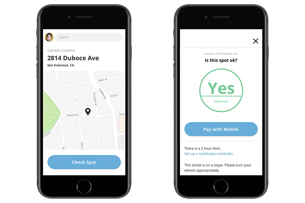
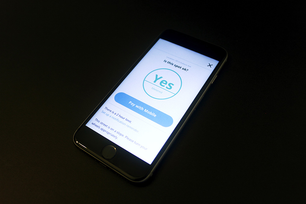
Initial home screen and approved parking screen
Context
My Issue With Parking
I’m often afraid to park anywhere. Though I’ve been mostly safe this whole time, I get anxious at the prospect of getting a ticket, getting towed, or worse, somebody yelling at me to get off their property. Often times, I elect not to drive to places for this very reason.
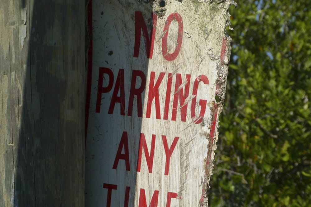 Additionally, street signs are often unclear and confusing. Despite testing several parking apps, I couldn’t find exactly what I was looking for. There wasn’t an app that could give me a “Yes” or “No” answer to the question, “Can I park here?”
Additionally, street signs are often unclear and confusing. Despite testing several parking apps, I couldn’t find exactly what I was looking for. There wasn’t an app that could give me a “Yes” or “No” answer to the question, “Can I park here?”
Design
User flows that anticipate needs and cover for different contexts
The focus of the design of this app concept was in the user flows, navigation, and functionality. The primary function of this app was the “Check Spot” feature which would determine the user’s location through GPS data and mine an inventory of local laws and parking rules. If these parameters were not enough, the app would ask a few clarifying questions based on the location such as “Is the curb yellow?” If the spot is okay, the app would let the user know along with other useful information like time limits and parking rates if applicable.
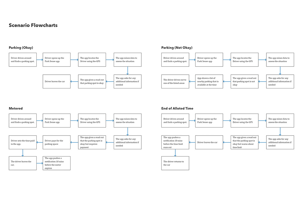
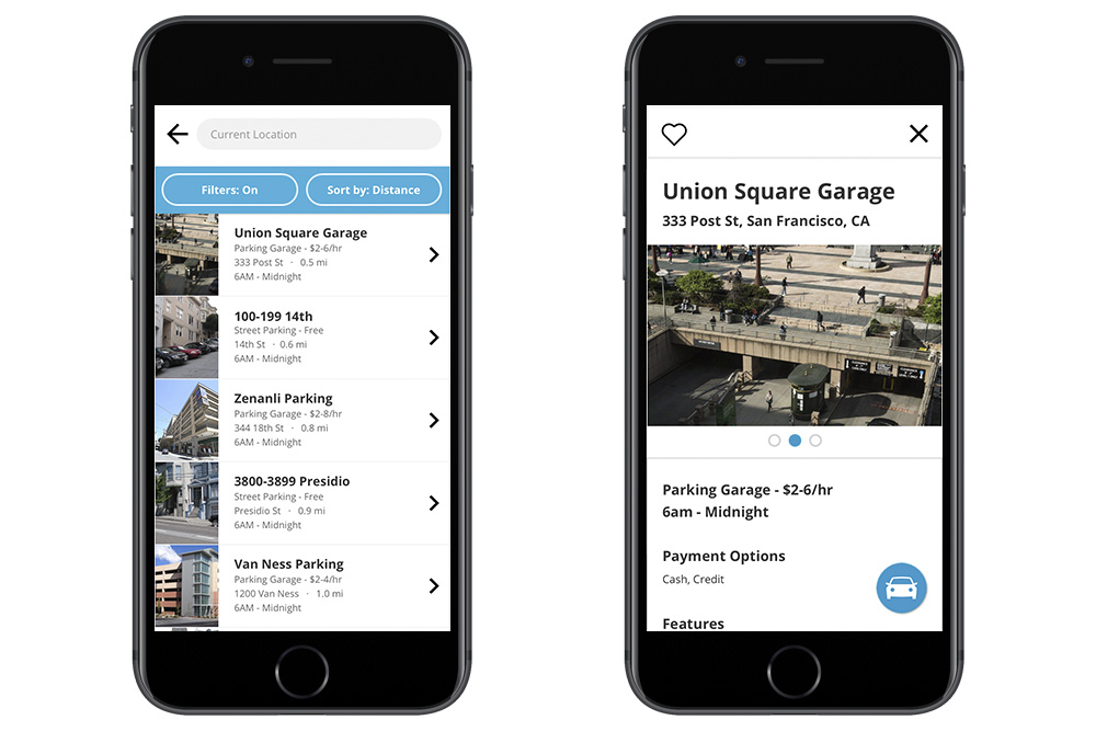
The secondary user flow involves searching for parking beforehand. A person can either search using parameters such as specifying parking type (garages, metered, street), price, wheelchair accessibility or safety rating. By default, the app only surfaces results that are currently open for parking.
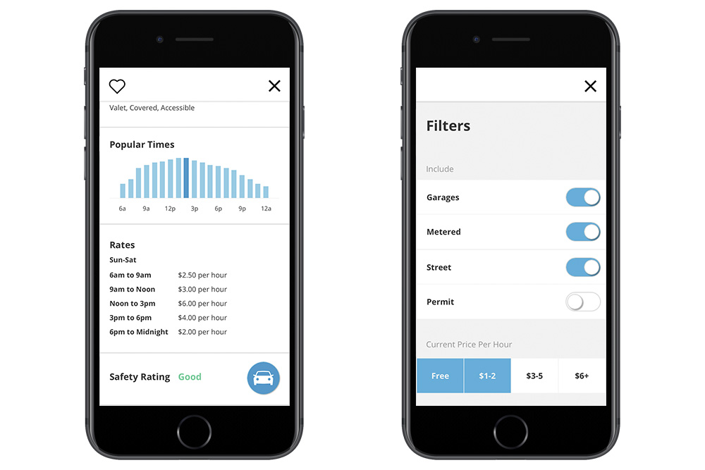
Once a user decides to look at the entry for a particular parking area, they can check out the rates, open hours, popular times, and safety rating. If they decide to go to this parking area, there is a button that, when pressed, sends the destination data to their default maps app. Many of the details I chose to surface in this flow was highly informed by user interviews and testing.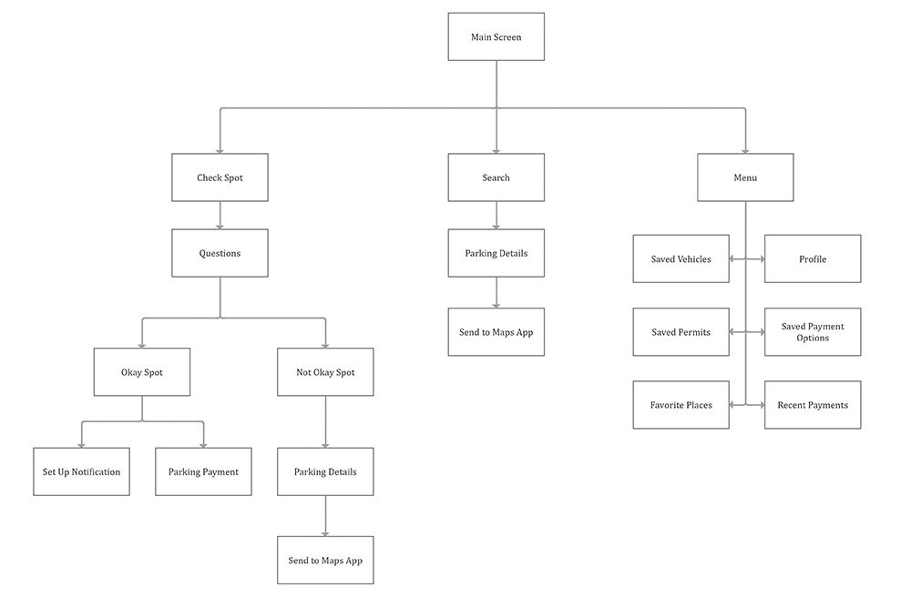
Primary spot checking user flows
In addition, if mobile pay is available, the app can allow the user to pay directly from their phone. If the spot isn’t okay, the app would say why and recommend close-by parking areas that are currently safe to park in. A large part of the thought process in creating this user flow is anticipating user needs at the appropriate moments whether that be payment functionality or time limit details. The secondary user flow involves searching for parking beforehand. A person can either search using parameters such as specifying parking type (garages, metered, street), price, wheelchair accessibility or safety rating. By default, the app only surfaces results that are currently open for parking.
Once a user decides to look at the entry for a particular parking area, they can check out the rates, open hours, popular times, and safety rating. If they decide to go to this parking area, there is a button that, when pressed, sends the destination data to their default maps app. Many of the details I chose to surface in this flow was highly informed by user interviews and testing.
Navigation architecture
RESEARCH
Revealing the diverse needs of others through open-ended interviews
Much of the design was informed through user interviews and in-person testing. The interviews were flexible and open-ended, often being more than 30 minutes each. Some common questions included, “In what situations do you second guess a parking space?” or “What are your priorities when looking for a parking space?” Generally, I tried to be open to discovering a person’s specific issues regarding parking.
Speaking to people about their parking problems also revealed different areas of need outside of determining whether a spot was permissible. Major frustrations included vehicle safety, parking during peak hours, or not returning to a car after their parking time expired. These needs spawned features such as safety ratings and expiration notification reminders.
Parking search results and parking detail page
Although many people are confused by parking signs and rules, these interviews allowed me to determine what exactly is difficult about them. Common situations included not being able to see a parking sign, curb colors, street cleaning hours, and what areas a particular parking sign apply to. This allowed me to make changes to my design that would better anticipate these difficulties.Speaking to people about their parking problems also revealed different areas of need outside of determining whether a spot was permissible. Major frustrations included vehicle safety, parking during peak hours, or not returning to a car after their parking time expired. These needs spawned features such as safety ratings and expiration notification reminders.
PRODUCT
Knowing the difference between a robustly functional app and bloated impractical one
Throughout the process of this app concept, I learned more about the decision-making process in developing a product. Initially, I started with my own individual needs in mind first and foremost. However as time went on, the interviewing and testing revealed other potential uses for the app. Though I believe that many good inventions start from a personal place, a product should be evaluated in how well it can be personalized and integrated into the lives of many different people.
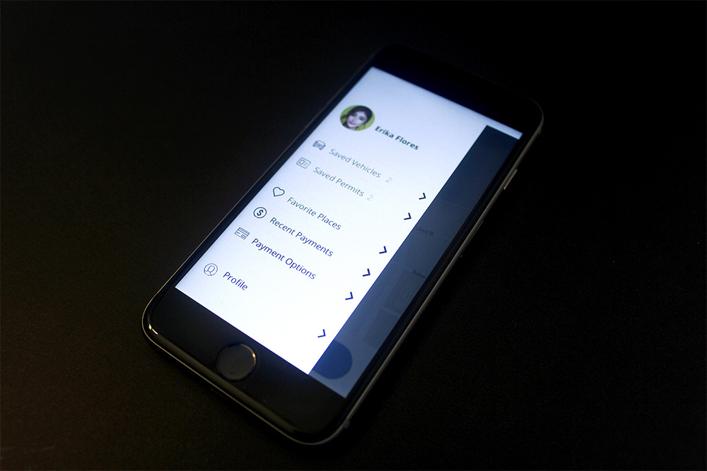
Profile menu displaying quality of life features like saved vehicles and saved permits
Nevertheless, having been a designer for different software companies, I know that human desires are infinite. There will be never an end to how many features, customizations, and technology that people want in a product. Trying to integrate as many features as possible is generally a recipe for disaster. As a result, the overall user experience becomes too complex, the interface becomes cluttered, and an engineering team can become too burdened with having to ensure that the program code is stable despite so many moving parts.
Parking detail information and filtering options were informed both by interviews and mindful decision making
Bear in mind that this app is a concept and not a fully functioning platform. While any software or product should reach of the skies, there are going to real-world limitations that will limit the functionality. Within ParkSense, certain information may not be accessible or even practical to obtain. For example, I believe having a “Safety Rating” would be a fantastic feature, but may be difficult to accrue accurate information about how safe a parking spot is and present this information on a screen objectively.